Friday, November 24, 2006
Tuesday, November 14, 2006
CD Wherehouse Poster
 CD Wherehouse Poster. A poster I did with Ross Chowles. I don't know why but it's one of my favourite pieces and I keep it stuck up at home. We found the copy in an old book on Blue Note records, I just edited it down into that paragraph.
Fruitree Ad
Yardley 442 Ad
Originally conceptualised by Stuart McCreedie and Graham Taylor-Warne while at Bester Burke, production finished off by Iain Thomas and Greg Cameron.
The success of the launch commercial for 442, the new male fragrance from Yardley, has a lot to do with the collaboration between two of the country's most interesting talents - Mukunda, director at production company Krishna Smiles Flowers Bloom and sound wünderkind Markus "Wormstorm" Smith at studio Say Thank You.

"No matter how well you crack a look and performance, you've also got to get the soundtrack right to take it over the edge.
That's why we hooked up with Markus, he's got a unique take on things," says Mukunda.
The commercial features two über-beings in tailored suits in a night time face off on a silver football pitch. The ad has a distinct surreal feel and they wanted a track to compliment the unique look and stand out from the usual. "Much to our delight, the direction that Mukunda wanted to take the music in was definitely out of the realm of conventional 'ad speak'," says Marcus. "And yet the finished result is a TV commercial that works incredibly well with all of its elements in place."
The commercial was conceptualised at Bester Burke with Greg Cameron and Iain Thomas* with the post production finished by Jannez Hendricks at Black Ginger.
* Originally conceptualised by Stuart McCreedie and Graham Taylor-Warne.
Mukunda and Bester Burke take it to the next level
If you¹re looking to create a commercial that stands out, don't hold back. That seems to be the idea behind the commercial for the launch of 442 - a new male fragrance and one of the biggest ads ever produced for Yardley.
 |
 |
And bold it is. "The idea is centered around male posing, and that's never a subtle thing. So Mukunda wanted to push this, turning the men in to über-beings - super fast, super strong and beautiful looking. And then to balance all the brawn with a heightened and stylized look," says producer Katherine Leach-Lewis. "So he had all the toys: helicopters, cranes, heavy post-production time, and in the end I think the results speak for themselves."
This Bester Burke commercial finishes off a flurry of high profile work that Mukunda and production company Krishna Smiles Flowers Bloom has been involved in over the last few months.
Next up is pre-production on a feature film, a music video for The Dirty Skirts and more of the same from the brain pool of local advertising creatives.
Monday, November 13, 2006
Woodlands Long Life Milk
Nokia Camera Phone
Thursday, November 09, 2006
Ad Talent

Cape Times
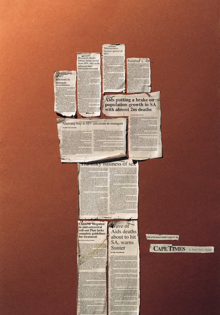
Cape Times. 2 Bronze Loeries, Finalist One Show, 1st Place in International Newspaper Marketing Awards.
The 'Fist' headline is: "The struggle didn't end in '94."
The 'Bulldozer' headline is "Building a nation?"
The 'Two-heads' headline is "As the world changes, how do we?"
The 'Megaphone' headline "Hear no evil. See no evil."
I enjoyed working on something that allowed me to comment on the world, or at least invite comment and interpretation through the work itself.
The Cinema Ad.


Miraculous Insecticide Chalk

Miraculous Insecticide Chalk. Loeries Finalist.
Does what it says on the box.


Saturday, November 04, 2006
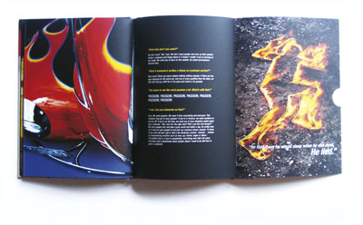
Markham Ignite Book

Markham Ignite Book. Grand Prix First Paper House Art of Design Awards. First in Category. Gold Craft Loerie for Writing.
I loved working on this project. The client was amazing and really and truly believed in what he was doing, and he infected us with that enthusiasm. Writing a book is hard work, as is designing one (I'm sure Kim Macdonald, the designer will confirm this) but the end results were well worth it.
We created a book with the word "Ignite" on the front cover, printed with material similar to what you'd find on the striking pad on a box of matches. The book itself slides out of the box, looking like a box of matches.
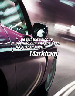
The book was compiled from 8 hours of video footage from meetings the senior management at Markham held. They were asked to discuss the new direction they wanted the company to move in, I collated that information into the book. We then applied the thinking we'd discovered in the meetings across the packaging, windows and every other aspect of the brand.
The client enjoyed me reading the copy to them so much, I ended up being the voice over for their TVC's and their 'Whispering Windows'.


| I'M THE MAN - What's Lies Beneath a refreshed brand | |
|
We’ve arranged to meet outside one of the brand spanking new Markham stores, Tyger Valley to be precise. I think the Foschini people do this so they can baby-sit the first in their rollouts; it always seems to be Tyger Valley first. It must be the proximity to The Foschini Group’s head office in Parow. Fernando Ventura waits outside the storefront, anxious as a parent whose child is about to perform on stage. “Let’s go have a cup of coffee first,” he suggests, “then I’ll take you round the store and you’ll have a better understanding of it all.” We head to a nearby coffee shop. Over a cappuccino, there’s no stopping Fernando. His enthusiasm spills over and his obvious zeal for the brand in infectious. I can’t wait to look around the store. Meanwhile, I get the background story. “It came out of a management strategy session held back in November 2002,” he begins. “We decided to reposition Markhams; as the only national men’s retailer in South Africa, we weren’t capturing enough market share. Also, in many areas, the brand stood for different things in the consumer’s mind. Like in Durban it stood for something different than in Cape Town. We decided we needed the brand handwriting to be uniform. Also, the stores were looking a lot like the female retail outlets, so we needed something unique for men, but without alienating women. We had to regain market share.” He slides an intriguing package across the table. “It’s all in there,” he says. I uncover a hardcover book, beautifully presented with an image of redhead matches on the front. Its packaging reads, “Ignite”. I’m getting the picture. I’m holding in my hand the sum of all the parts. I flip to the first page. “The brand is the logo, right?” it says. In bold, black font follows one word, “Wrong”. Then, “The brand is the sum of everything we do from the e-mail we send down the hall, to the ad on TV. A salesperson on the floor is the brand when a customer interacts with him. The brand is not a logo. It is us and everything we do, stand for and believe in.” Fernando fills me in on the menswear retail position. “Firstly, a significant percentage of menswear buying decisions are made by women especially at other unisex retailers. Then, men often are relegated to the back end of the store. We needed to do something dramatically different. We looked around the world, but you can’t find stand-alone menswear retailers. However, we do command a place in the South African retail marketplace … South Africa has a unique way of doing things.” So, I’m understanding, the store experience is going to breathe the brand. He flips to a page in the brand book headed, “We’re going on a brand journey, FASTEN YOUR SEAT BELT!” I read somewhere at the bottom of the page, “It’s not just a retailer anymore, it’s a somebody, a damn fine sexy somebody. It’s a club where guys can come and relax, chill out and catch a game. It’s a hardware store with clothes that’ll finally give guys in malls a place to go and be guys. And because this new brand is so well defined, it doesn’t matter how old the customer is or where he comes from. It’s a mindset. A sense of style.” The customer, it looks like, is all-important in this scenario. “Oh yes,” nods Fernando. “Look, we’ve mapped out the customer journey, identifying all the touch points the consumer has with the brand.” It begins with the brand informing the customer by advertising, direct marketing or word of mouth. Then it attracts him, by location, signage and window displays. It welcomes him through the doors and orientates via clear navigation. Browsing is followed by interaction with staff, ending in purchase and finally reassurance through having the brand in hand, telling a friend and membership of the Markham men’s club. “We had to set aside egos in the process,” explains Fernando, “There was a whole team of us working on this. We did it with First Partnership in the UK, which is a brand consultant. We wanted a very objective group without preconceptions and baggage. We decided that the culture had to change. Even how we recruit now is based on the customer journey. Fundamentally, we’ve arrived at a different way of doing things.” Markhams needed to be perceived differently, from the staid formal wear retailer to a trendy fashion store. “We moved away from being a men’s outfitter to a fashion retailer,” says Fernando, “shedding 131 years of baggage.”
Coffee done, we move to the store. It’s bright, well lit, spacious and vivid. Nothing bland about it. “The passion in store is nothing like what goes at back at the office,” comments Fernando. “We spent an entire week doing the brand book, seven hours of interviewing with our agency, Jupiter Drawing Room, involved throughout. Every step had to ensure value transfer,” he says. “We had the brand vision, identity and language all documented before we designed the store. We’ve ensured that all our partners and agencies have played a key role. We’ve done Corporate Identity manuals for all our overseas partners, manufacturers and trend advisers … we’re big on involvement.” Fernando stresses that while Markham may be pursuing the ultimate in “cool”, they don’t want it to be perceived as “too cool”. “The last thing we want to do its intimidate people like some snobby model. Treat people the way you want to be treated.” And what about affordability? “Price has become more of a differentiator as opposed to brand,” comments Fernando, “and Markham will always be a value retailer, though not price driven. We know we’re perceived to deliver quality at an affordable price,” he says, “so we match product to the consumer’s perceptions.” It’s not a case of dumping suppliers either. Read the black and white in the book: “We want long-term relationships with our suppliers, not some one-night-stand based on prices or trends. If we say we love you today, it means we’ll love you tomorrow. Just don’t forget to do the dishes or you can go live with your mother.” You’d better be joking on the last bit, but the first two sentences have a good ring to them. We like this kind of guy, us girls, and I’ll bet most guys wouldn’t mind being perceived as just like him either. Markham is a significant contributor to The Foschini Group’s profits, so while the brand overhaul is fun, sexy and a bit cheeky, the reality is that it was borne out of a financial and business decision. With 172 stores country wide, Markham can’t afford to have gotten it wrong. My feeling is they’ve got it spot on. How can you argue with, “I am the man”?
| |
 It’s been around for 130 years, Current management took the decision to reinvent the brand, drop the ‘s’ for starters, and overhaul the stores. Markhams got sexy. It’s now Markham. The Marketing Director, Fernando Ventura, spoke to Cindy Lee Moritz.
 Now Markham is about a contemporary, sexy, confident guy, someone who Fernando says is, “Always a hero.” The brand book puts it this way: “(These men) live where all Markham people should live – in the trendiest, most impressive apartment imaginable.” The new look store emulates that type of home. And the visual merchandise and point of sale material speak with the voice of this hero: “They got in and drove … no destination and no time limits”, “Danger was his only friend”, and “Don’t mess with fate, she will always win” sets the tone for the kind of guy the brand is relating to. It’s your choice of George Clooney, Brad Pitt, Lucas Radebe, Sting, David Beckham or the Benni McCarthy type of guy. Seemingly diverse, but with these things in common: passion, confidence, a sense of style and a hint of mischief. All without being arrogant. It’s the kind of guy you meet and the ‘spark’ of the meeting stays with you. Fernando calls him a ‘hunter’ who’ll seek out the right piece, “he still gets a buzz out of wearing a great suit.”
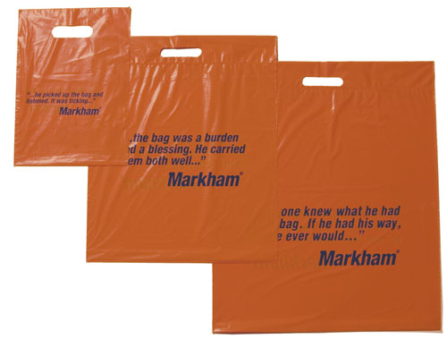


Musica Thumbs Ad

Musica Thumbs Ad. This got pulled out of judging at the last minute because it ran too late.
Primi Piatti Packaging

Primi Piatti Packaging.
I consider this one of my stranger pieces of work, just because the message we needed to impress upon people was that their kitchens are incredibly clean (which they are). While it's not something I'd normally do with food packaging, I think we solved it in a novel way, spoofing the design and layout from washing powder boxes and detergents.
Musica Talking Gift Boxes


Musica Talking Gift Boxes. Silver Loerie.
We decided it'd be interesting to use ironic black and white pictures on Musica gift boxes, considering their usual aesthetic is much more contemporary. While writing the headlines for the boxes, we discovered that people enjoyed writing their own headlines much more than reading mine.
AMH Mechanical Aid Logo

AMH Mechanical Aid Logo.
Quite a nice solution I thought for
"Medical aid for your car."
Gringo's Tequila Packaging
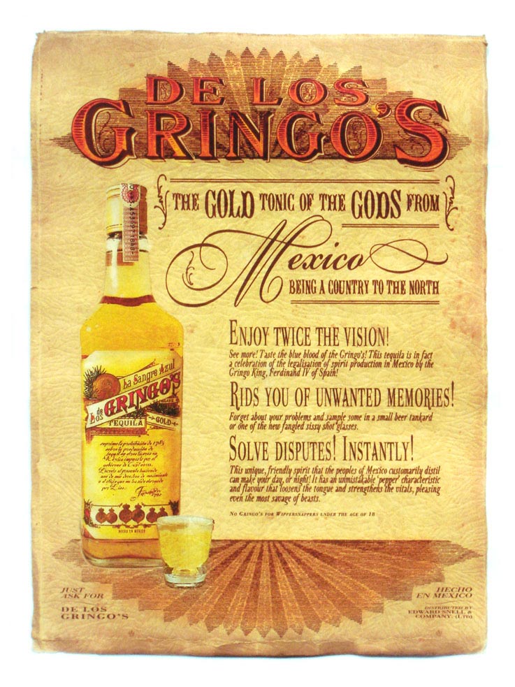
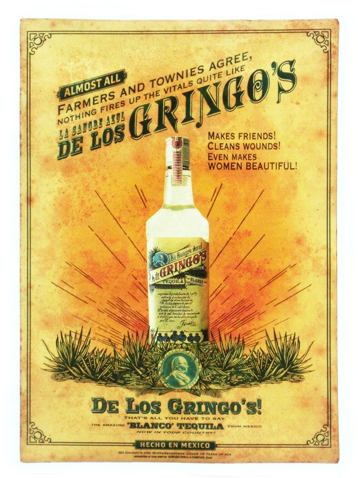
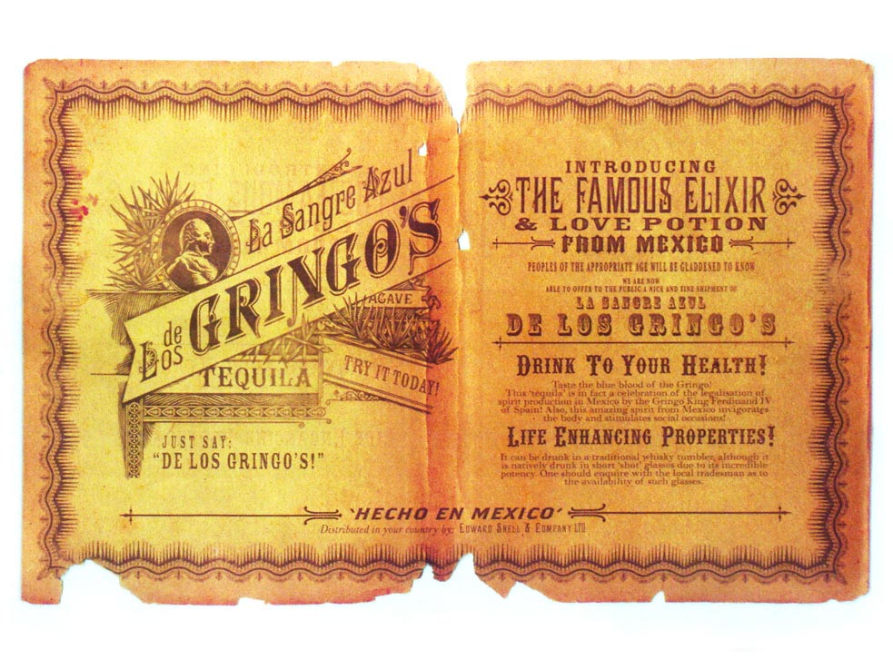
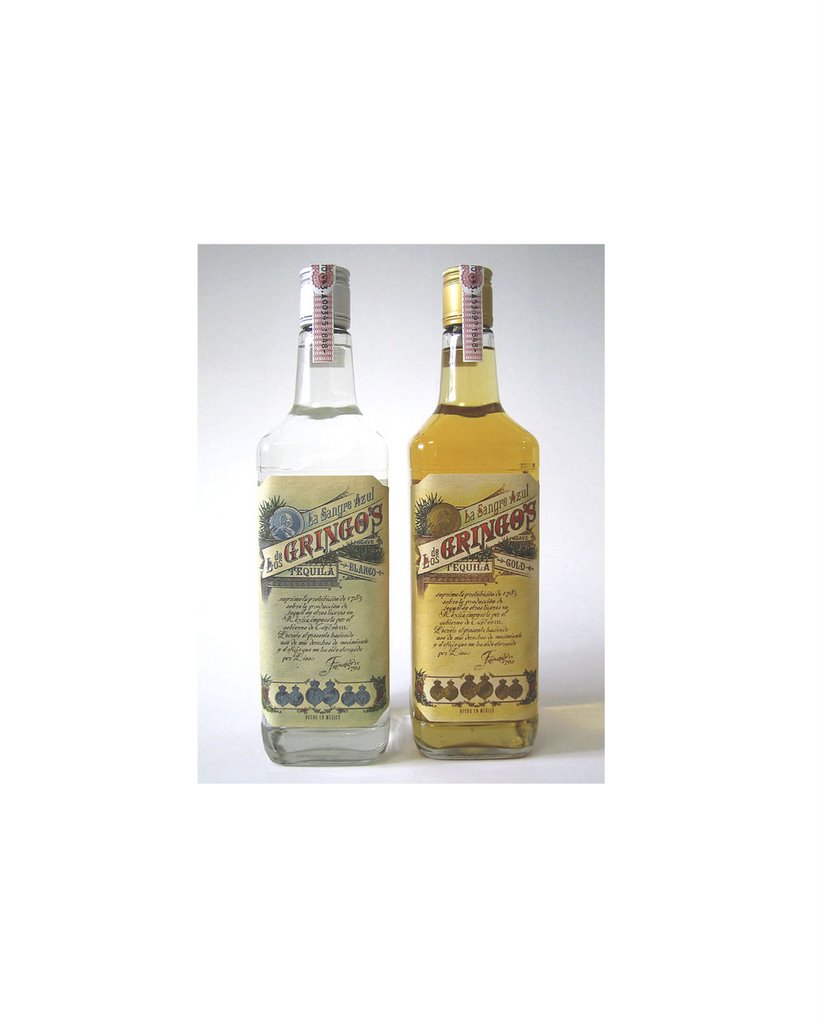

Gringo's Tequila Packaging. Loeries finalist.
The original packaging for this was incredibly kitsch, we ended up doing this as a nice way to create credibility and a sense of heritage for the brand. The posters, were a finalist in the craft for writing category of the Loeries (as well as several other categories).
Musica Scout Packaging
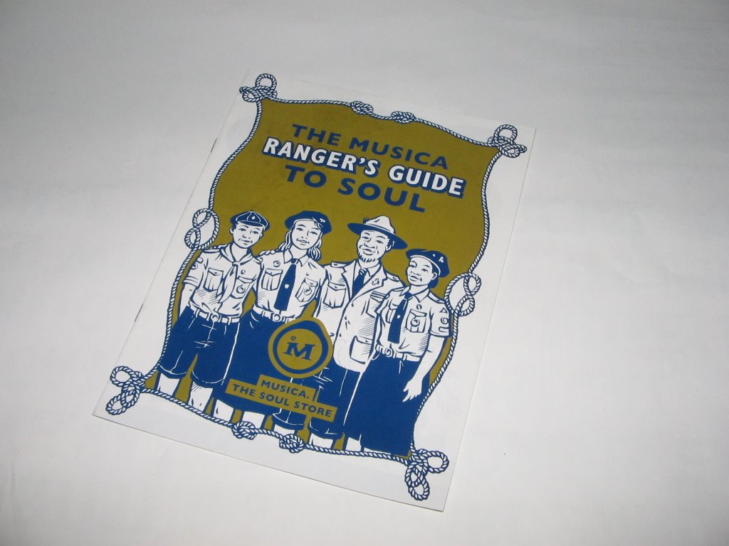


Musica Scout Packaging.
This was fun to work on, besides being threatened by the scouts for trademark infringement (they can be quite mean when they want to be).
Thursday, November 02, 2006
Design Indaba 8
This was an exciting project to work on, mainly because when you're designing for a design festival, you can really set the cat on fire and bring out the juggling elephants. The campaign was based around the central thought of "Stop. Think. Design." or the idea that designers need to take responsibility for what they create. Hence, in the print campaign, we named and shamed, in a sense, the designers responsible for the AK47, Whites Only Signs, The Florida Ballot and more.
The poster itself is an example of design with a conscious, the plastic bag it's printed on is preprogrammed to degraded over time.
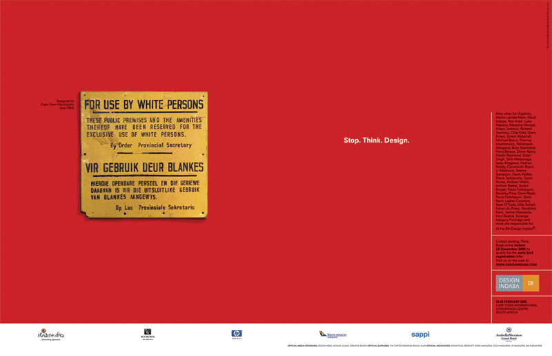
Design Indaba 8: Stop. Think. Design.
As design becomes an increasingly respected tool, designers walk the inevitable tightrope of power and its corollary: responsibility. While for previous Design Indaba speaker, Ross Lovegrove, this could mean the intricate possibilities of maximising the use of a solar powered car, fellow designer, Neville Brody broaches the subject: Can design feed people? Indeed, while a TV commercial's 30 seconds of fame may be fleeting, and a print ad a momentary distraction, a work of design, argues The Jupiter Drawing Room Cape Town, may have more lasting implications.
With the potential longevity of design as a starting point, Jupiter designers have developed a campaign for Design Indaba 8 with the following logic: Stop. Think. Design. "The campaign is about realising the potential and power of design," says designer Carla Kreuser. "It hopes to explore new possibilities rather than be a preacher of doomsday messages. We're looking at design as something that goes beyond a 9 to 5 desk job, as something both powerful and empowering." Adds Jupiter Design Writer, Iain Thomas, "Of all the media, elements of design like a logo or a product's packaging are designed to endure, and we hope to create a sense of the social impact of that extended lifespan, and the responsibility which must accompany it."
How better to in investigate responsible design than to venture a gaze at its antithesis? Designs like the infamously misleading Bush-Gore Florida ballot and the Apartheid era's officious "White's Only" signs find new life in the Design Indaba 8's print campaign. Designers and the institutions responsible for these "artworks" are acknowledged beside their creations to emphasise designers' intricate relationship with the society in which they operate, and their responsibility (or lack thereof) to that society.
Further tribute to the functionality of design comes through the Design Indaba 8 poster, perhaps the most ingenious element of the campaign. "Where a traditional poster lives as a piece of cardboard attached to a wall and is eventually relegated to waste, the DI8 poster is a perfect marriage of function and form. Created from oxo-biodegradable plastic, the bag contains an additive, which allows it to decompose once exposed to the environment until all that remains is simply water, humus and carbon dioxide.
The poster reveals "The Life Cycle of Litter", and details the lifespan of commonly discarded items. While a tin can may last for a century, the poster will cease to exist "When you want it to." "We wanted to illustrate the concept through the design of the poster, to positively explore the choices people have as designers," says Thomas. "Certain designs may be functional or beautiful enough to develop a second life in their original form. However, if a design cannot function beyond its initial purpose, then at least prevent it from being another item of discarded waste."
Sent as a mailer inside the biodegradable poster is the Design Indaba brochure. Once again, it becomes apparent how, in Thomas' words, "One person's design becomes another's rubbish." The brochure's jacket cover is the product of hours of dustbin-digging reformed into a 2D design graveyard. Further occurrences of design's unsuccessful second life feature inside, with a broken heel illustrating a wasted shoe in the fashion, jewellery and trends section, and a house skewed by a hurricane introducing the importance of architecture. Says Kreuser of the dilapidated house, "When we found that image, we noticed that while some houses had survived the hurricane, others completely collapsed. Another example of imperfect design becoming wasteage."
The focus on functionality is becoming increasingly relevant in the design community. "Particularly in South Africa, where we have limited resources", says Kreuser, "design needs to have a social conscience. It's not necessarily about change on a major level it can mean something as simple as designing a chair which is more ergonomic, more comfortable, more suited to its purpose." The designers Design Indaba 8 is attracting are impassioned and compassionate people who are concerned with design as an improving tool. "We live in an age which is aware of its circumstances and has a desire to be responsible. The Stop. Think. Design. campaign is the obvious next step," says Thomas.
Issued by: Kate Kilalea


